Mobile-First Magic: Navigating the Shift to Mobile-Centric Web Development

Mobile-First Magic: Navigating the Shift to Mobile-Centric Web Development
Let’s highlight the growing importance of mobile-friendly websites, offering advice on responsive design and ensuring an optimal user experience across all devices.
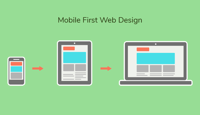
The emergence of the magic of Mobile-First
The digital revolution has transformed the way we interact with the world, and at the heart of this transformation is the magic of Mobile-First. Today, web browsing is moving increasingly towards smaller screens, underscoring the crucial importance of mobile-centric web development.
1. Smartphones reign 📱
Smartphones have become our daily companions, and it is on these screens that the magic first happens. Users browse, search, and make purchases on the go. A web site that does not follow this trend risks losing its magical connection with users.
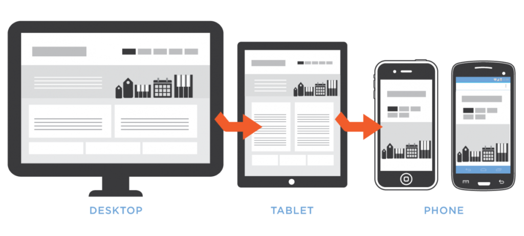
2. Responsive design: The art of flexibility
To embrace the magic of Mobile-First, responsive design is key. Web sites must be flexible, adjusting harmoniously to all screen sizes. The goal is to create a seamless user experience, whether you navigate from a desktop computer, a tablet, or a smartphone.
3.Speed optimization for quick enchantment ⚡
Magic works most effectively when speed is a priority. Mobile users are impatient, and a slow web site can break the spell. Speed optimization becomes a magic wand to guarantee fast and smooth navigation.
4.Concise content for immediate impact 🚀
In the Mobile-First era, content must be concise and impactful. Users want a quick response to their needs, and the content must delight them from the first glance. Striking images, clear text and impactful calls to action create a magical experience.
5.Continuous testing to preserve the magic ✨
The magic of Mobilе-First does not remain static. Continuous testing is essential to ensure that the magic persists. From usability tests on different devices to compatibility checks, every detail counts to maintain a magical user experience.
Conclusion: The art of mobile enchantment
In conclusion, the magic of Mobile-First lies in the ability to captivate and adapt. By embracing this approach, websites become enchanted places where every interaction is a magical experience. Let’s navigate together towards a world where the magic of Mobilе-First guides every click, every scroll, and every moment on the digital web.🌐📱✨
To our extraordinary customers,
Your vision is our inspiration, and each project is an adventure that we undertake with passion. With us, creativity is endless, ideas are limitless, and innovation is constant. We are more than a team of dedicated professionals; we are your partners in making your digital dreams come true.
Whether it’s designing a captivating website, developing an innovative application, or creating content that resonates, we’re there every step of the way. Our commitment to excellence is reflected in every line of code, every pixel of design, and every immersive interaction we build.
Do not hesitate to contact us. Your challenges are our opportunities, and we are ready to meet them together. The adventure has only just begun, and we can’t wait to continue it with you.
The team that transforms ideas into reality,